Show your own data
The easiest way to bring your data into our charts is using Gapminder offline app. You can also use your data with bare vizabi running in a web browser, but to do that it’s also better to start by importing the data into Gapminder offline and then do “export to web” so you will have a generated code example you can directly open in web browser. By modifying that example later you can gain more flexibility
This tutorial will get you started: it describes how to bring a data table from MS Excel into a bubble chart.
TLDR version
- Download Gapminder Offline
- Prepare and clean your data table in Excel, so that it looks like one of the examples, provided in Gapminder offline
- Save As… —> choose CSV format
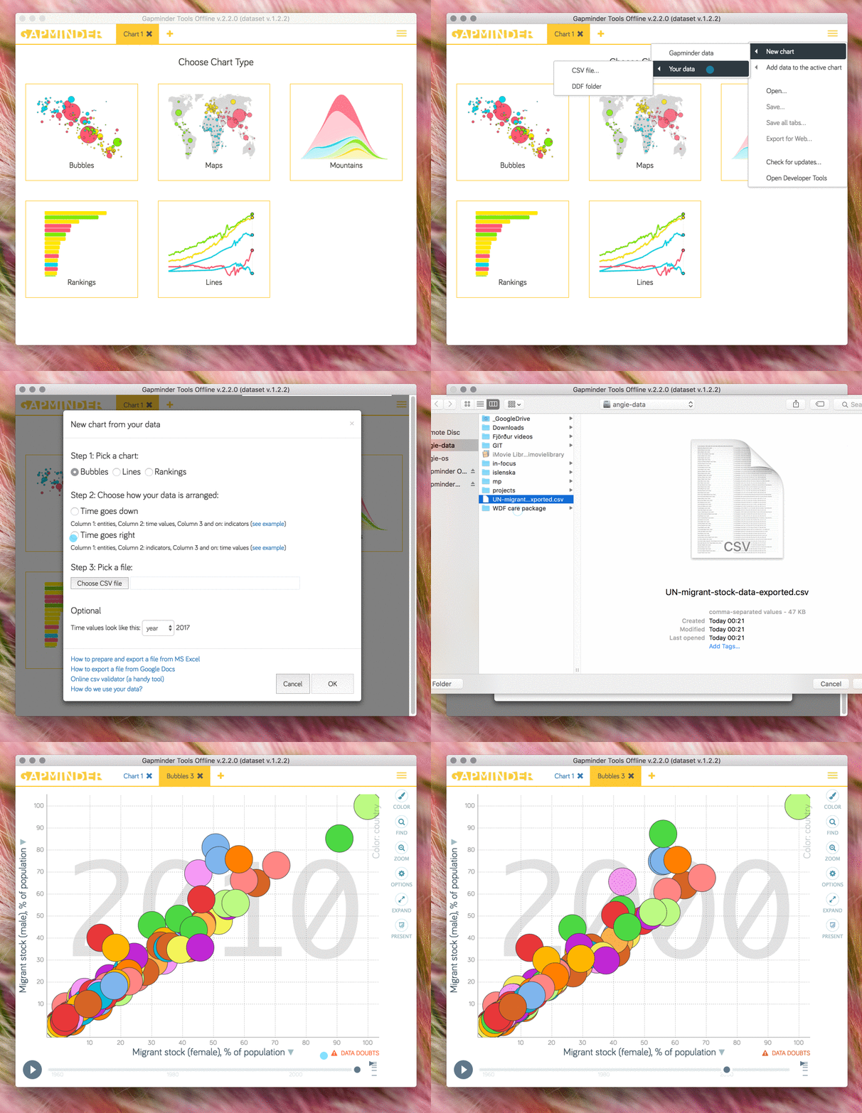
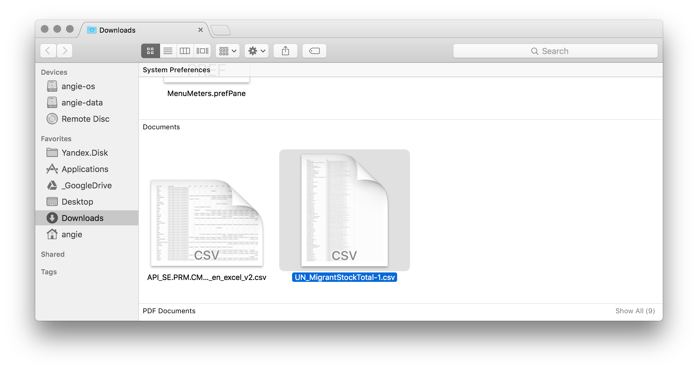
- Open the file in Gapminder offline. Below i’m using this file: ⏬ CSV
Longer version
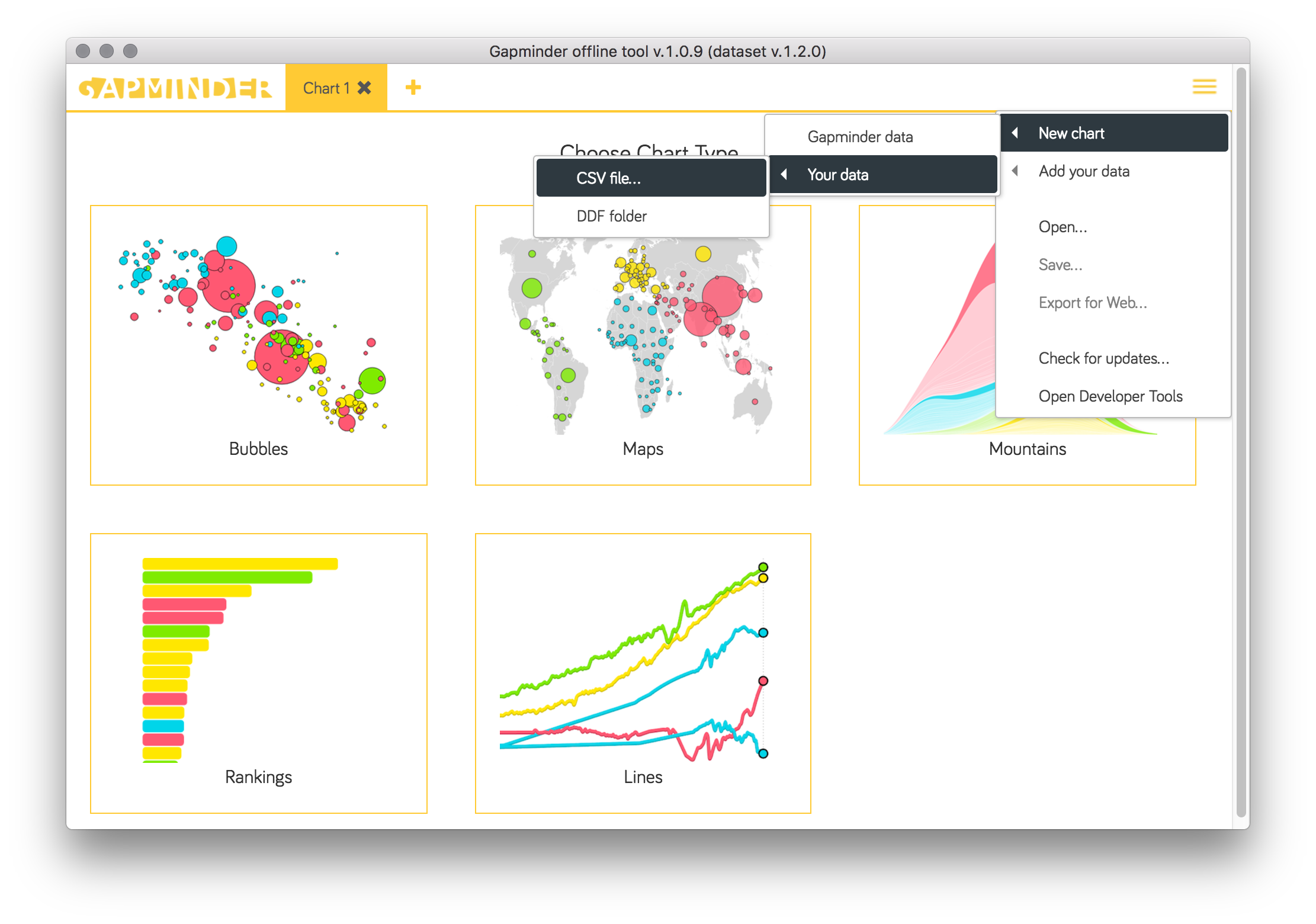
In gapminder offline, go to the menu in top right corner.
Choose “New chart —> From your data —> CSV file”
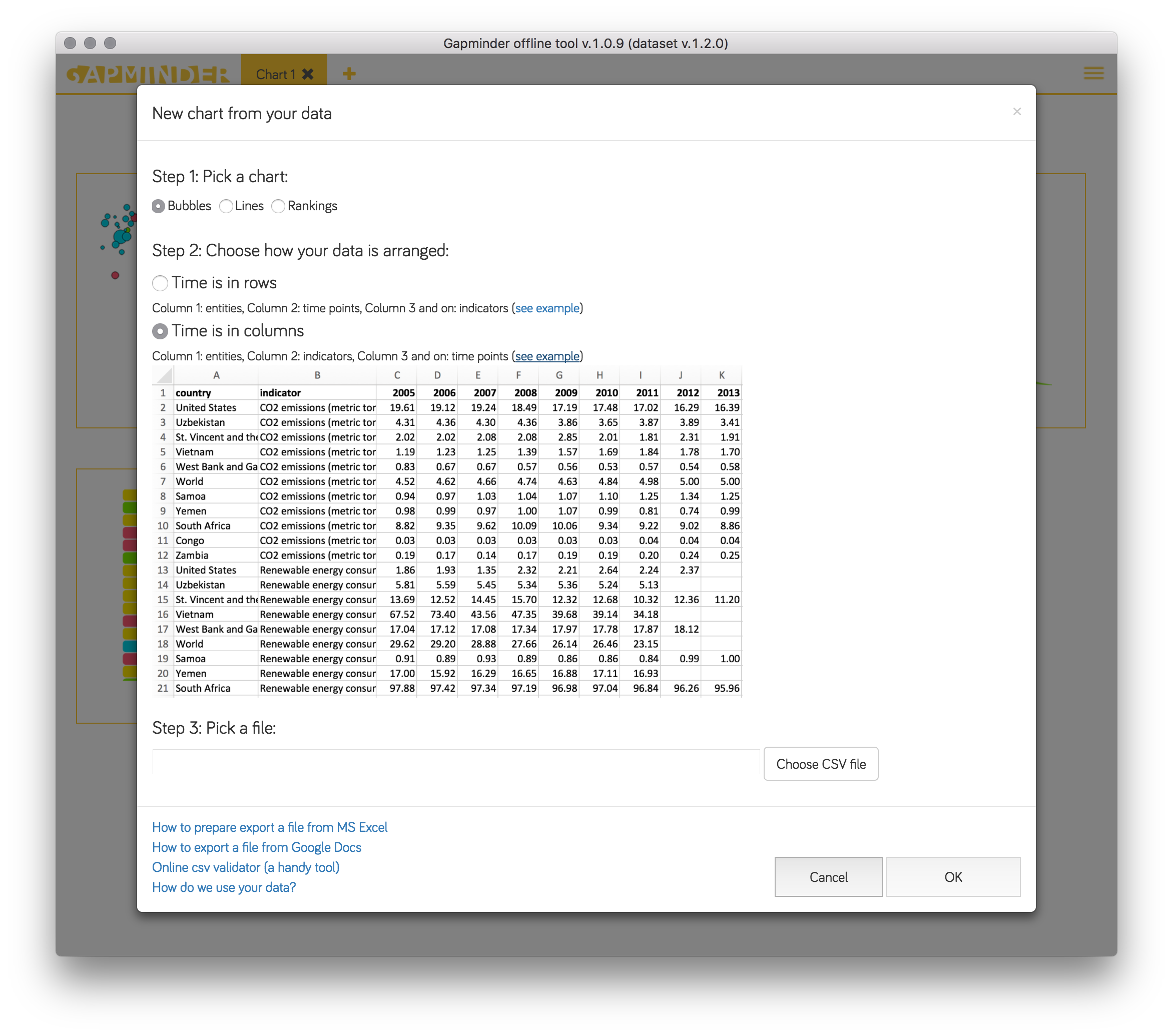
A dialog will show up with two options: Time in rows and Time in columns. Click “see example” and look at the provided tables. You should adjust your data to look like either one of the examples. No extra stuff!
Open the example file in Excel: migrant stock data from the UN population division. ⏬ XLS
Choose the tab with the data you are interested in.
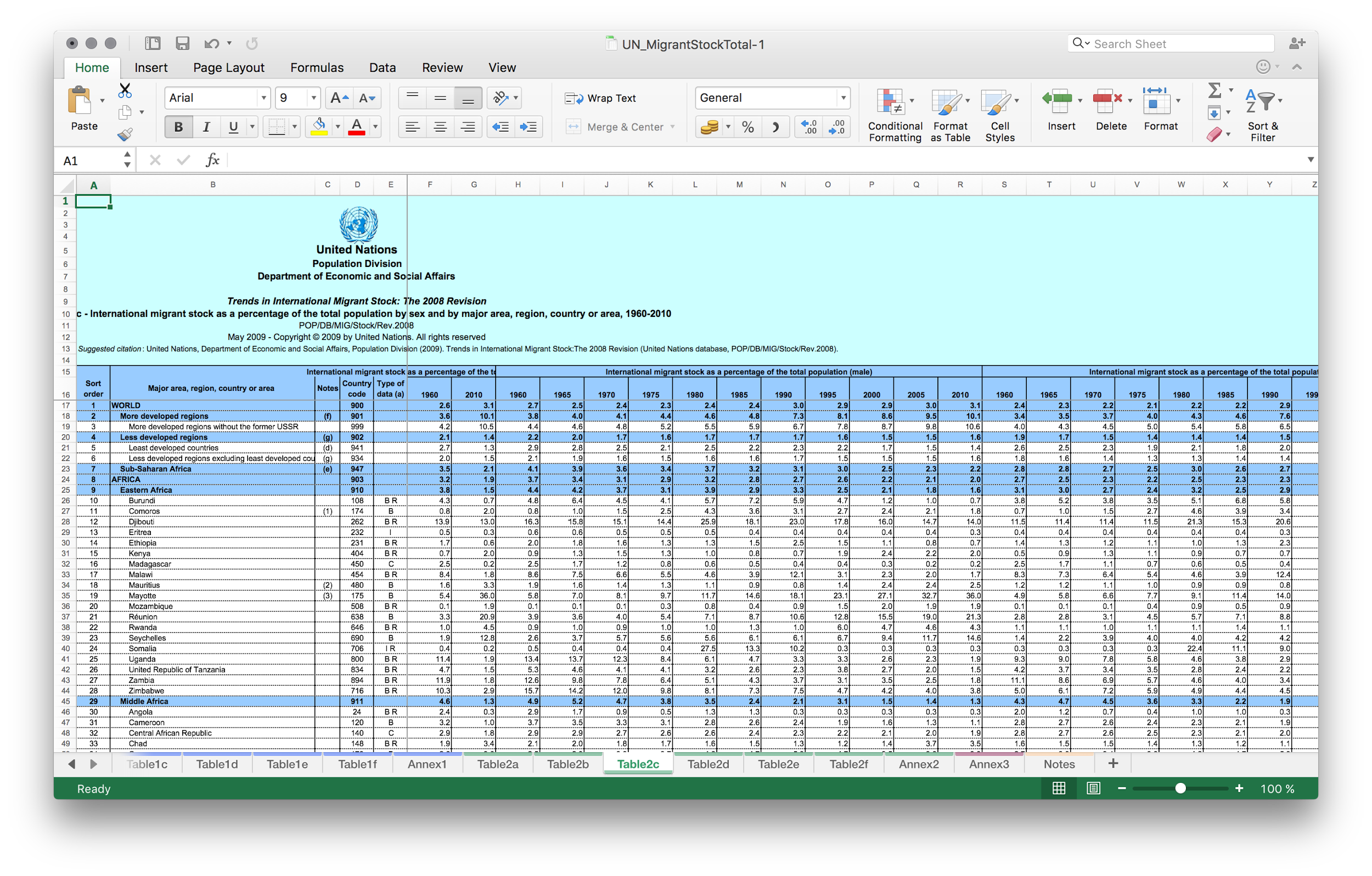
Remove the header rows and the logo picture
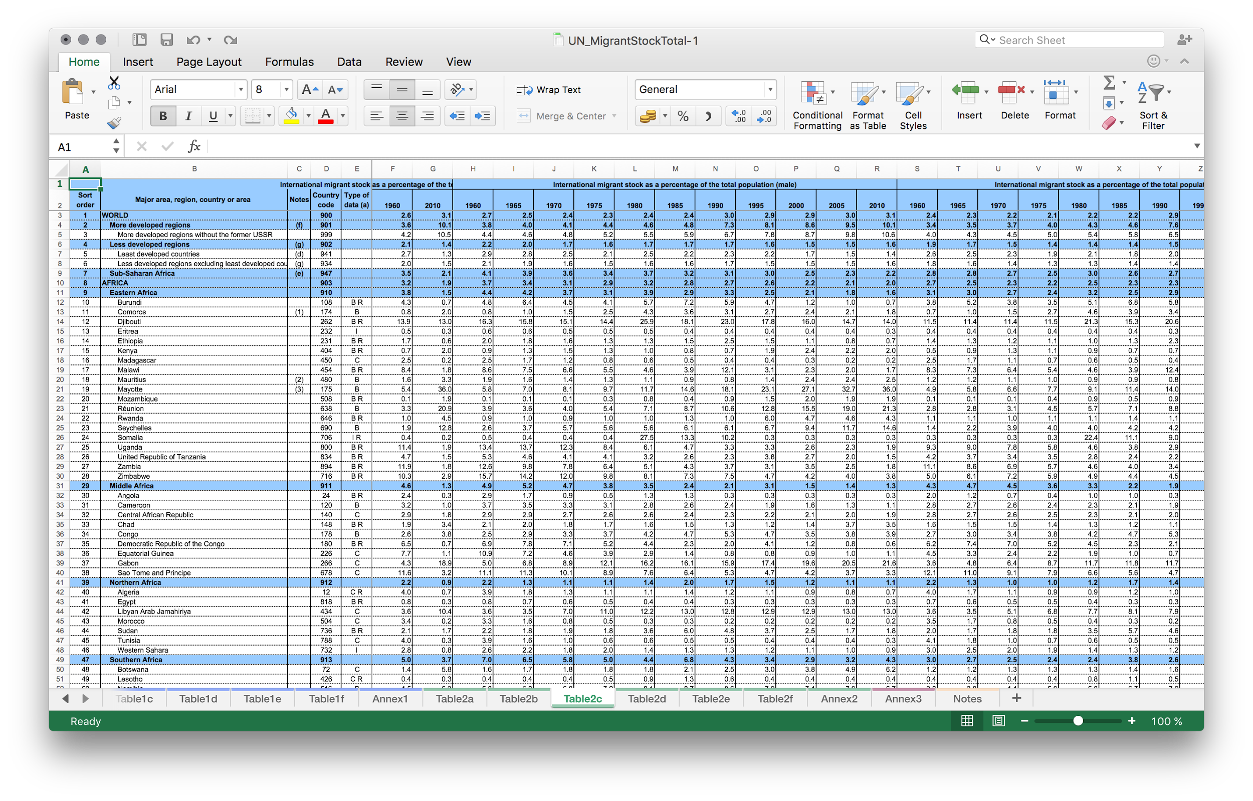
Remove the columns you don’t need
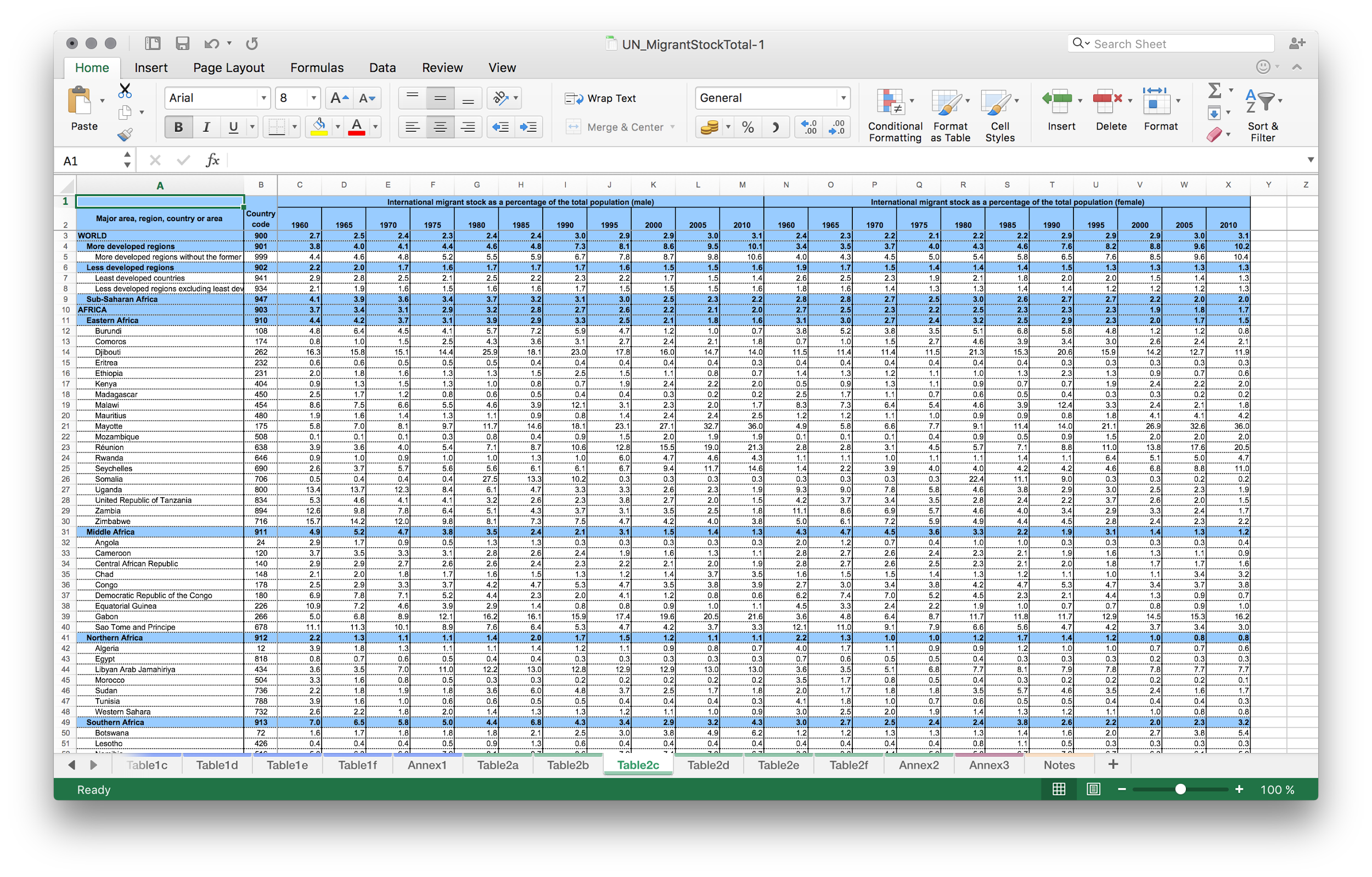
Suppose we are only interested in countries.
Remove aggregation rows (blue): like, world, africa, europe, etc
Here i sorted all the rows by “country code” column. All the blue rows happen to be together. So it’s easier to remove all at once.
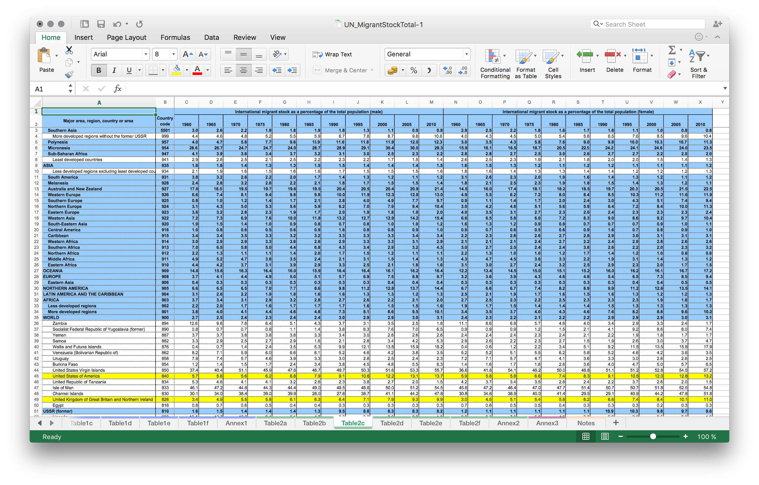
Remove the country code column too
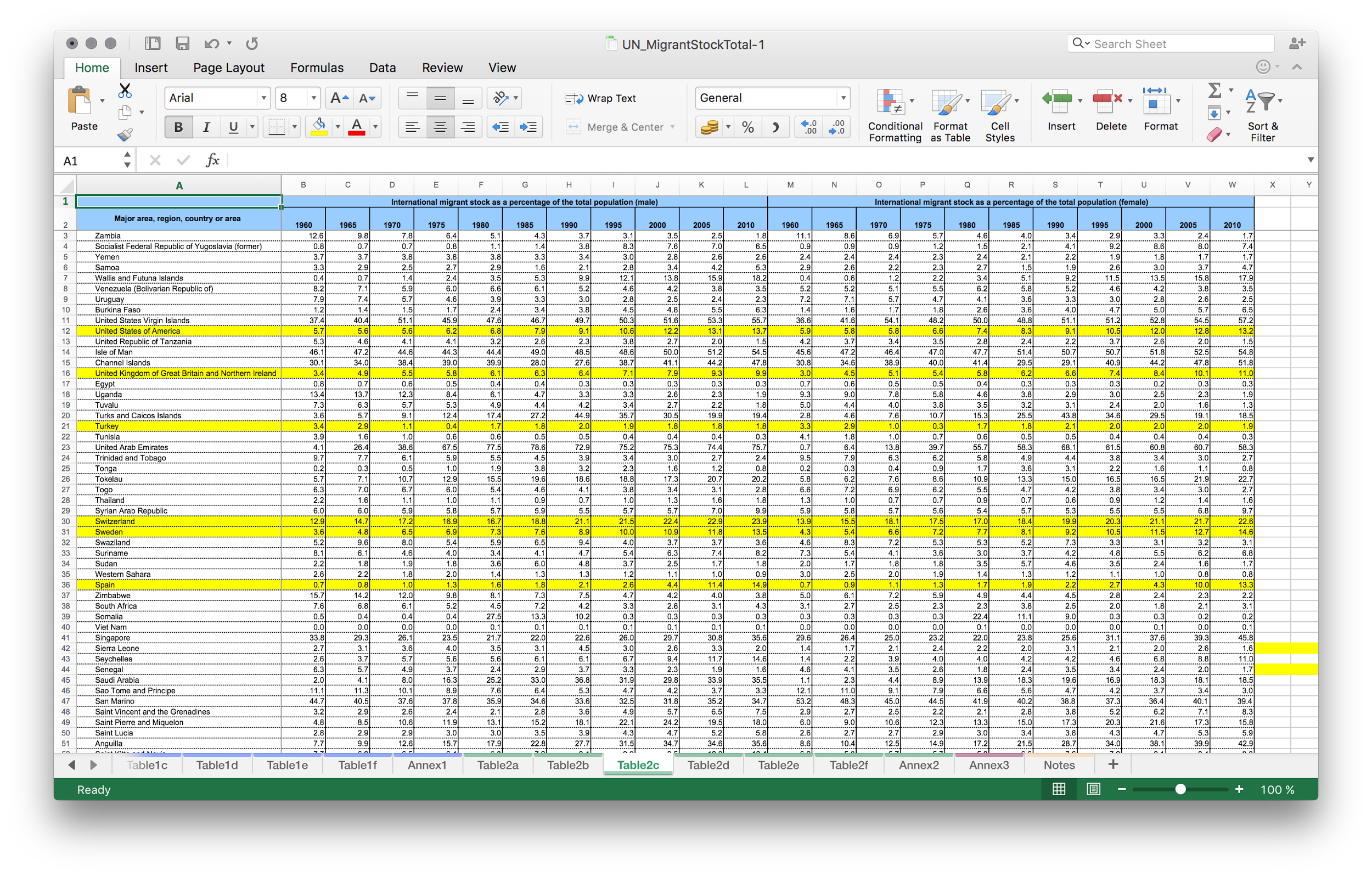
Reset the formatting of the table cells
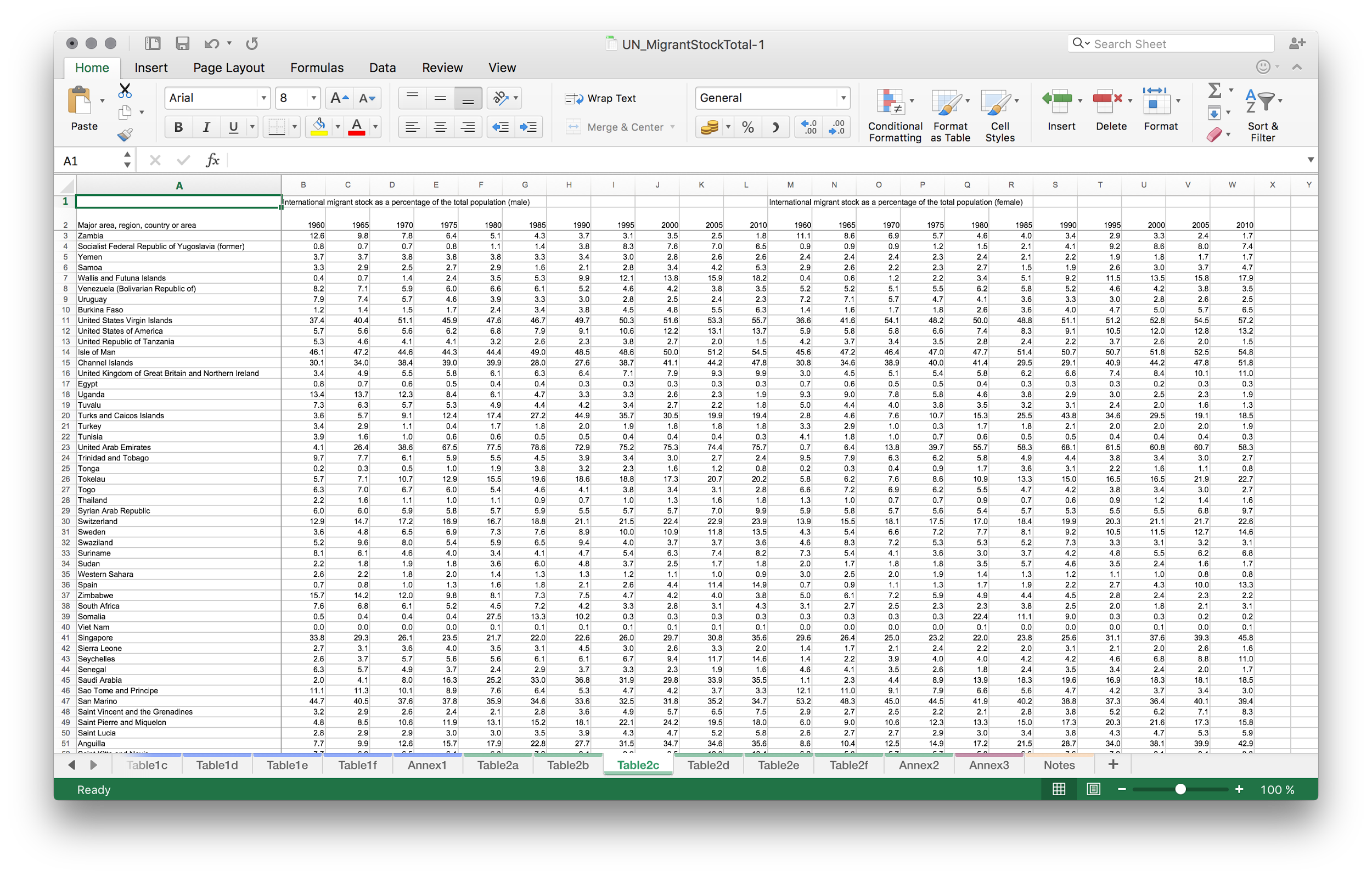
Now in this table we have two indicators side by side (migrant stock: male and migrant stock: female). This is not matching the format Gapminder offline can consume. So we should follow the example and move indicators one below the other.
Copy the entire table and paste it below with some lines in between. We will remove them later.
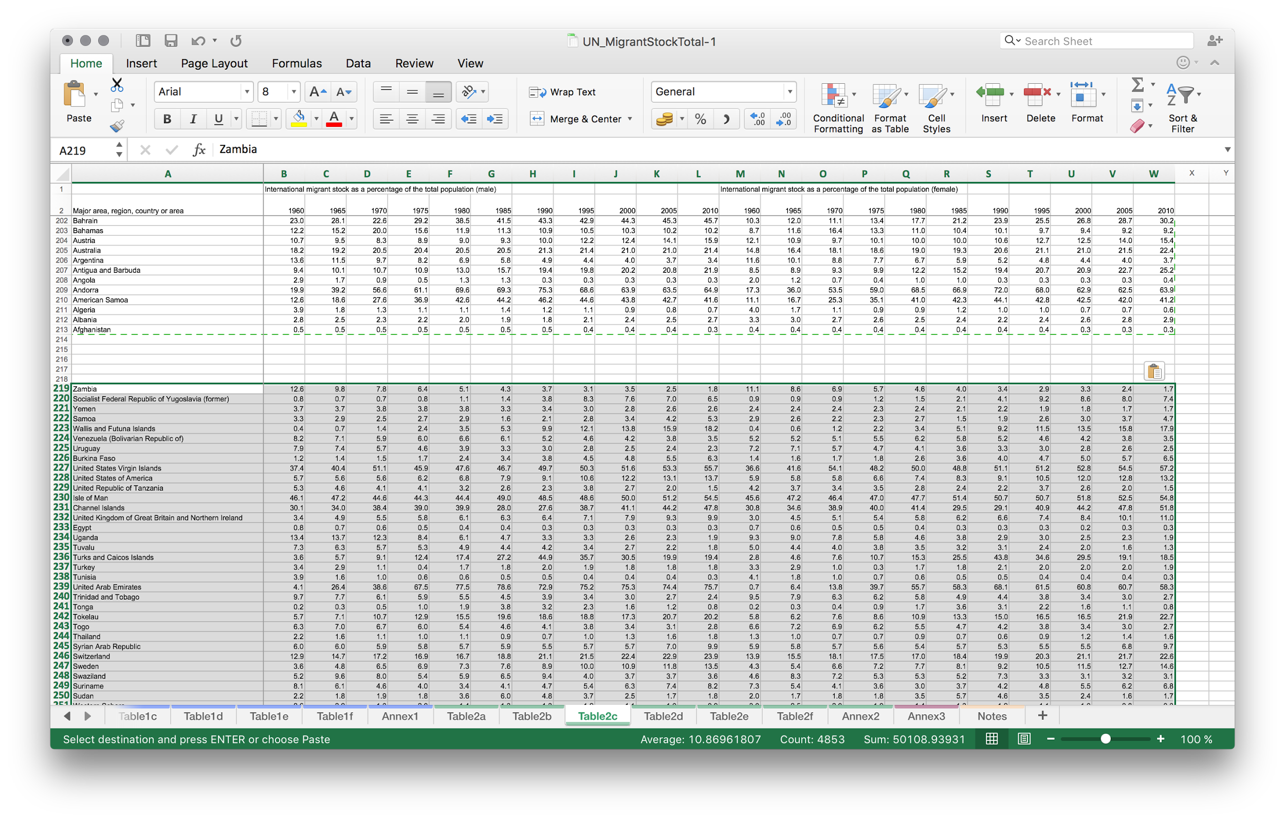
Remove parts of the tables so that one indicator is above and another one is below.
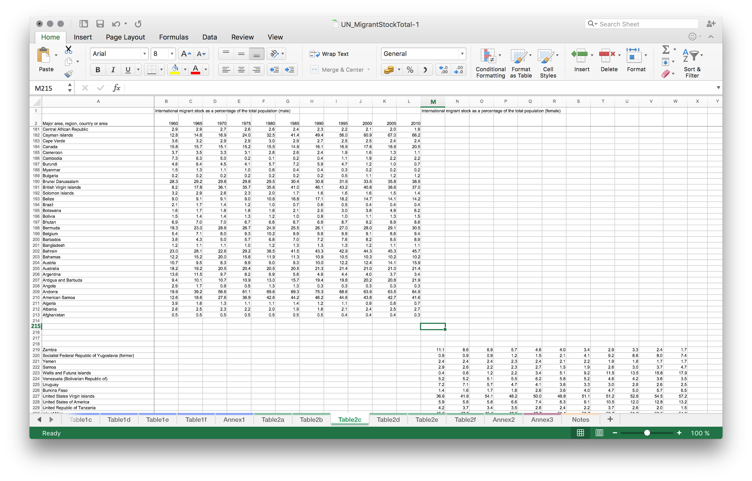
Shift the table below so that the columns would use the same time points as the columns above. Note: time points should really match here! You need to check that they match correctly.
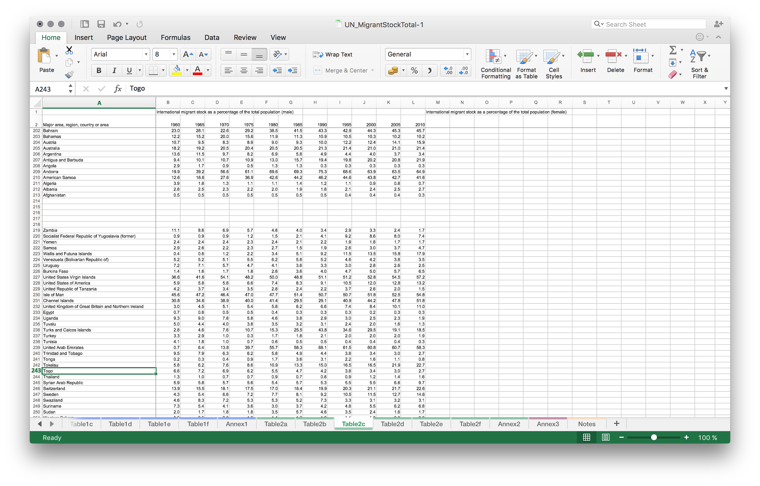
Add an extra column after country names and before the time columns (it should be column 2).
Write “indicator” on top
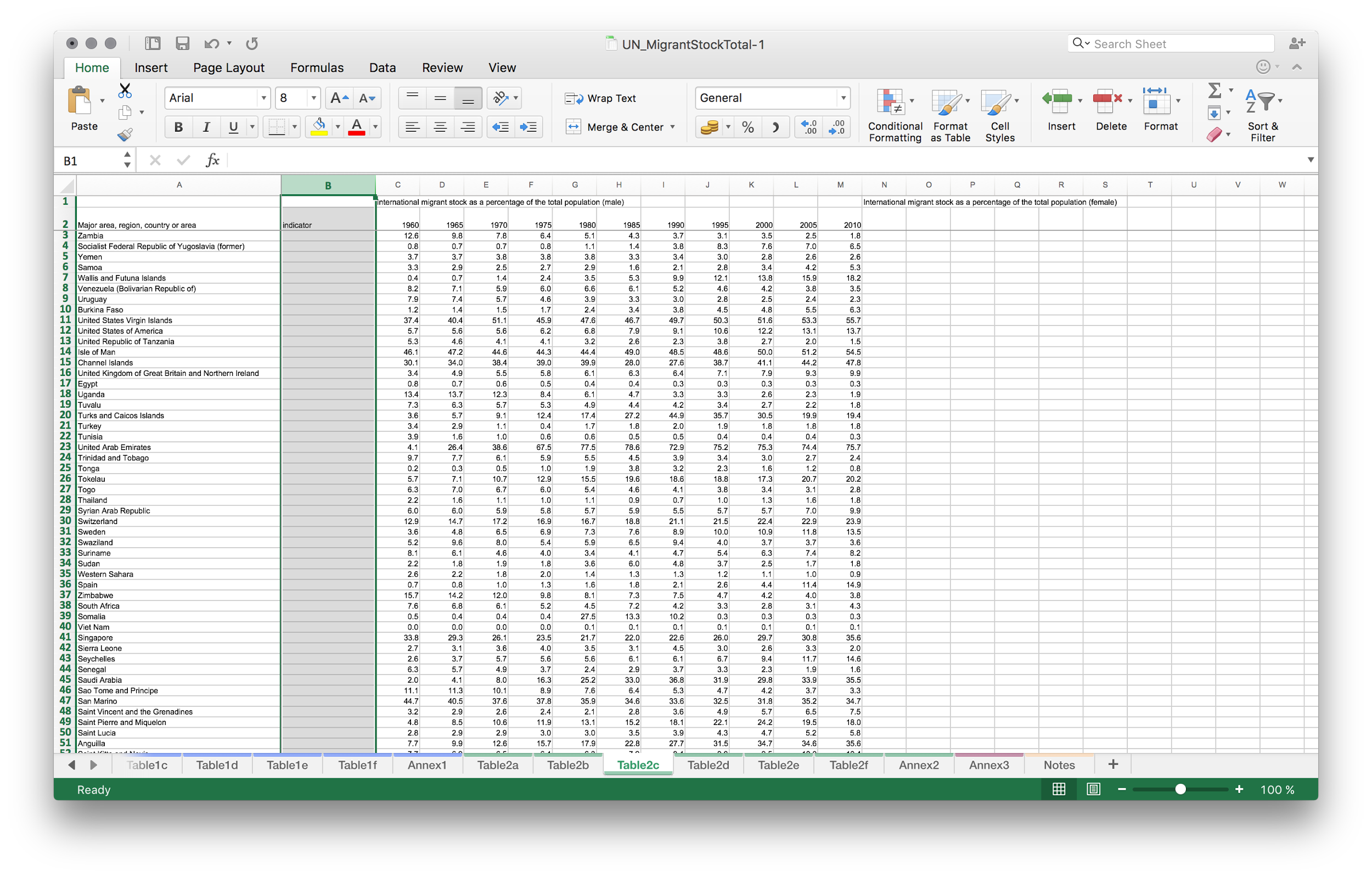
Put the indicator name for the first part of the table. Here i wrote
Migrants (male), % of the population
long names might not look good in the visualisation later
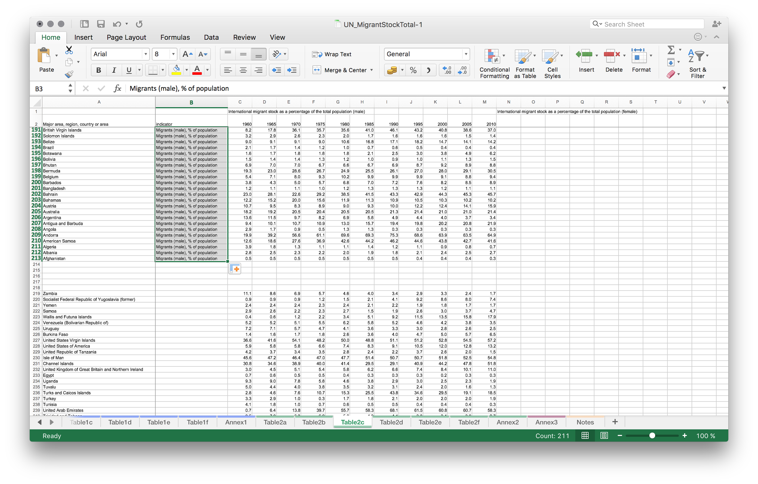
And fill the name of the second indicator:
Migrants (female), % of the population
Drag the corner of the cell to fill all the cells
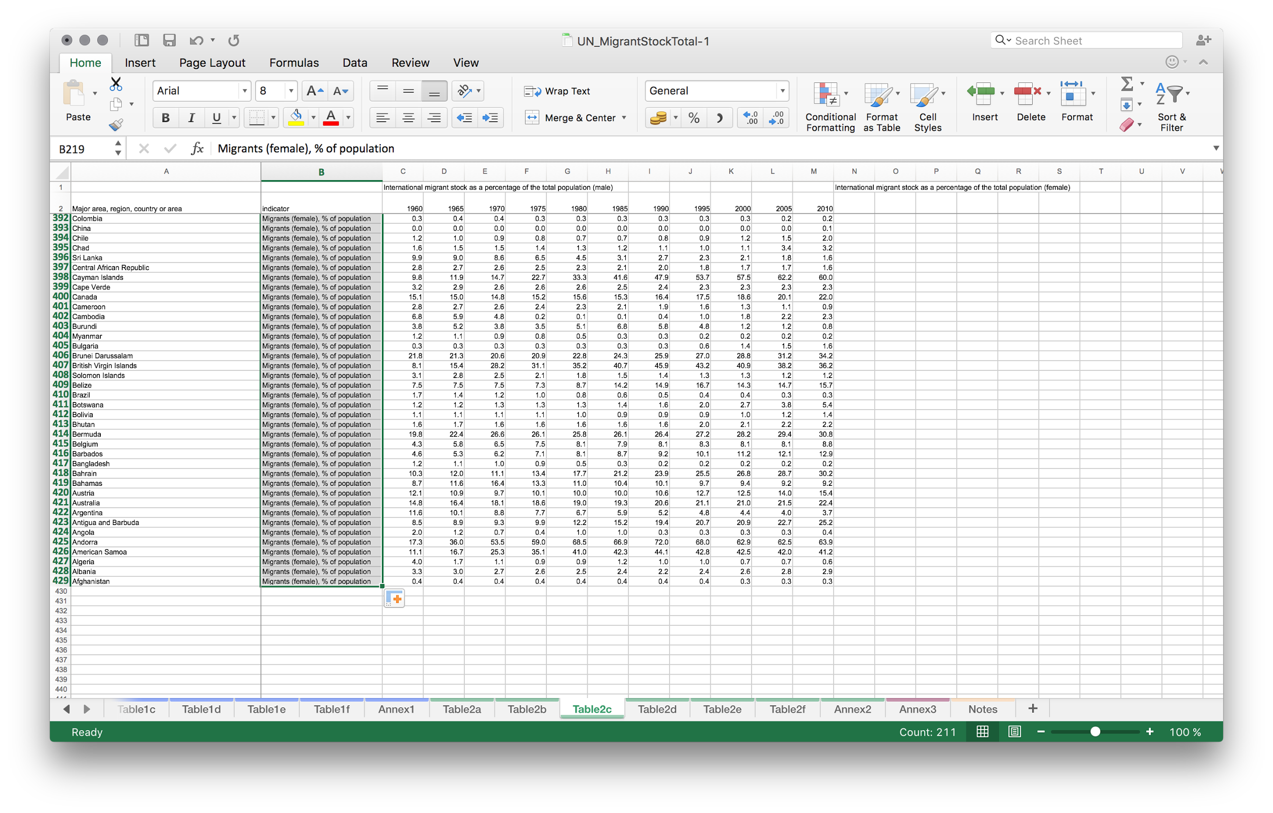
Remove the extra lines we had between the indicators
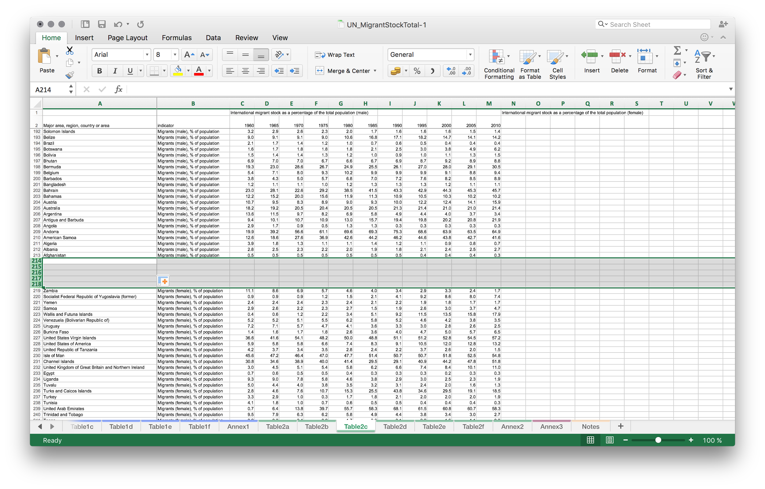
Remove the first line that used to contain indicator names — this is important!
The first line should contain the headers: country, indicator, 1960, 1965 and so on…
Remove also the columns to the right of the table, the ones where the data used to be, they now look empty but there might be residuals.
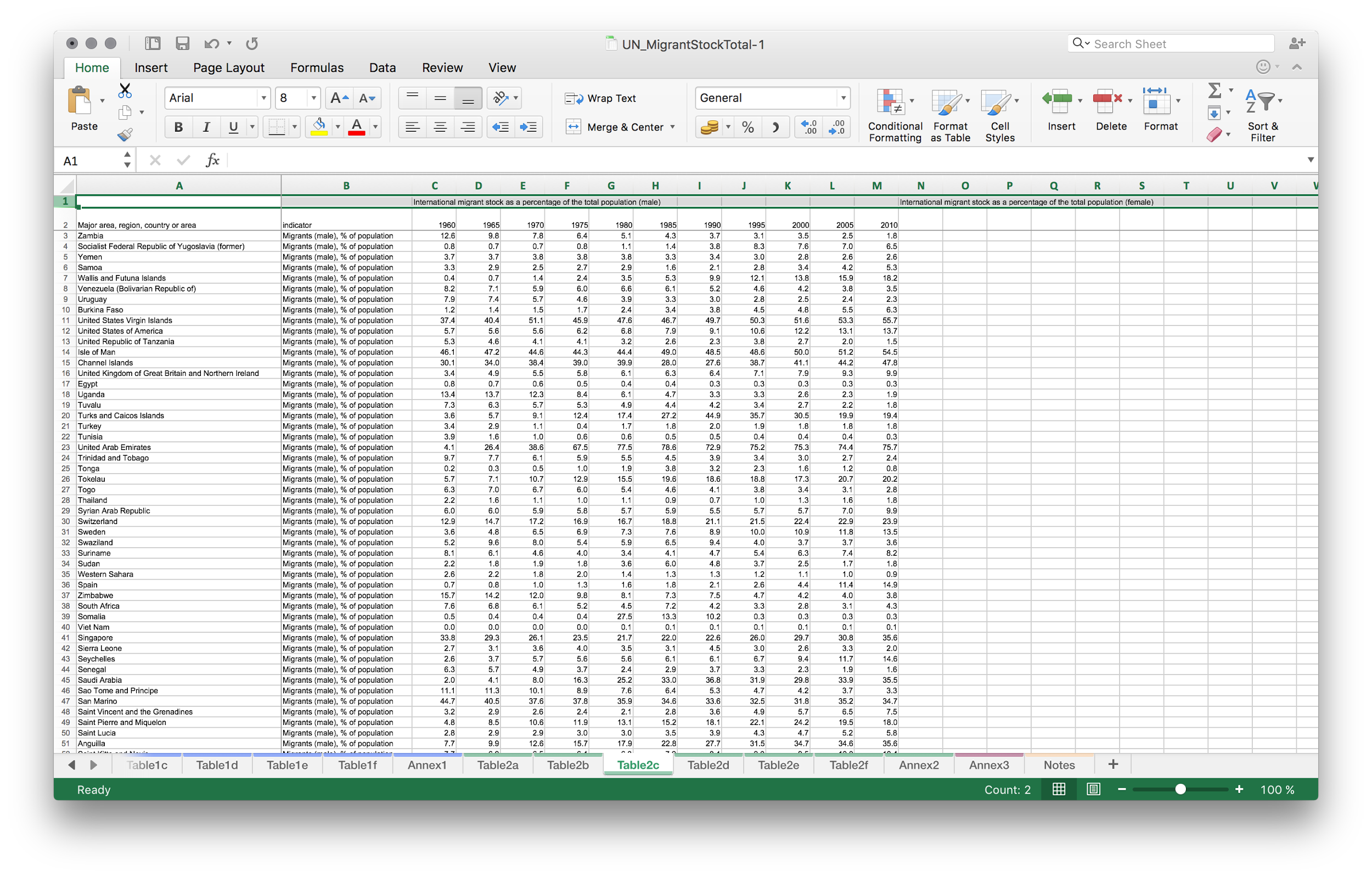
Now have a look at the data. Is there anything strange there?
Depending on your computer’s cultural preference, some values may have dots as decimal separator (like in 9.6, that means almost ten). Some may have commas (like in 9,6 that also means almost ten). Either one should work but it has to be consistent across the table!
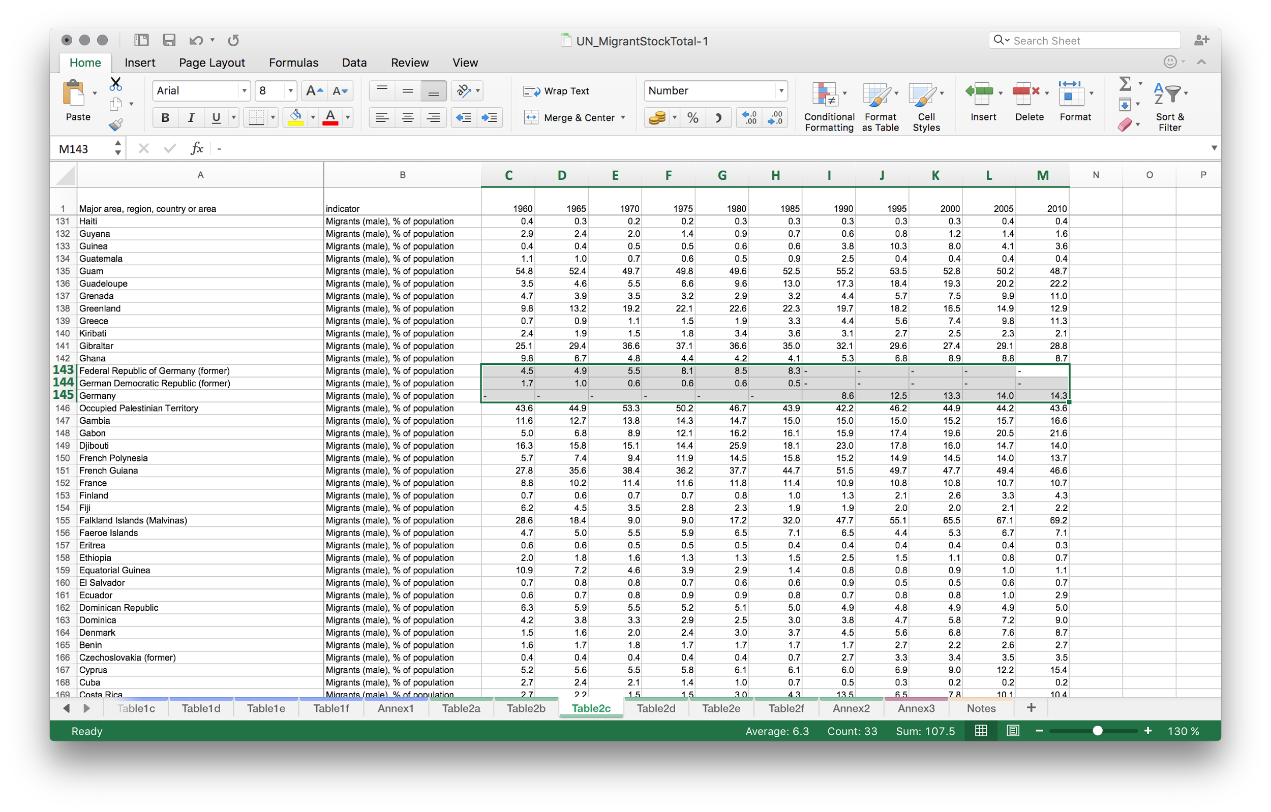
Missing values should have nothing in their cells. Here i found missing values for Germany to be “-”, so i remove them.
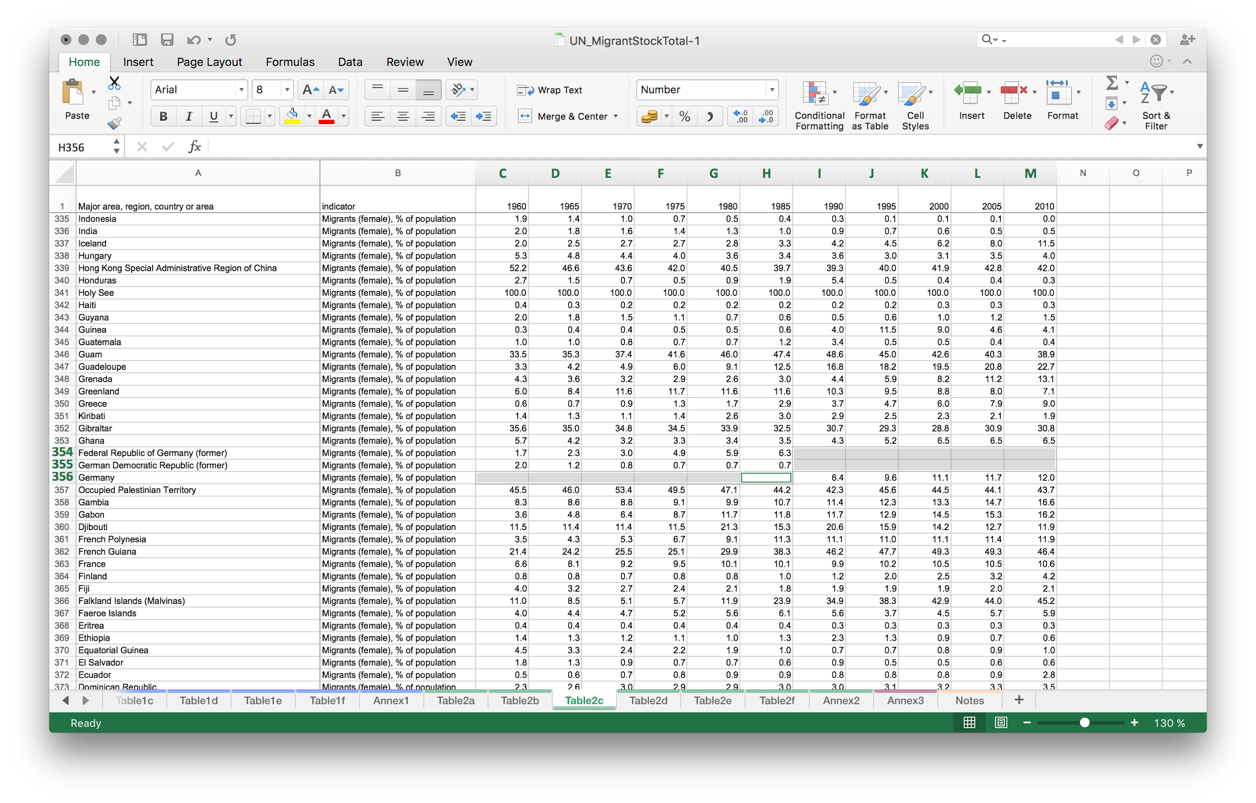
Ok, now the table looks clean and following the example from Gapminder offline
Go to file —> Save As —> Comma-separated values (.csv)
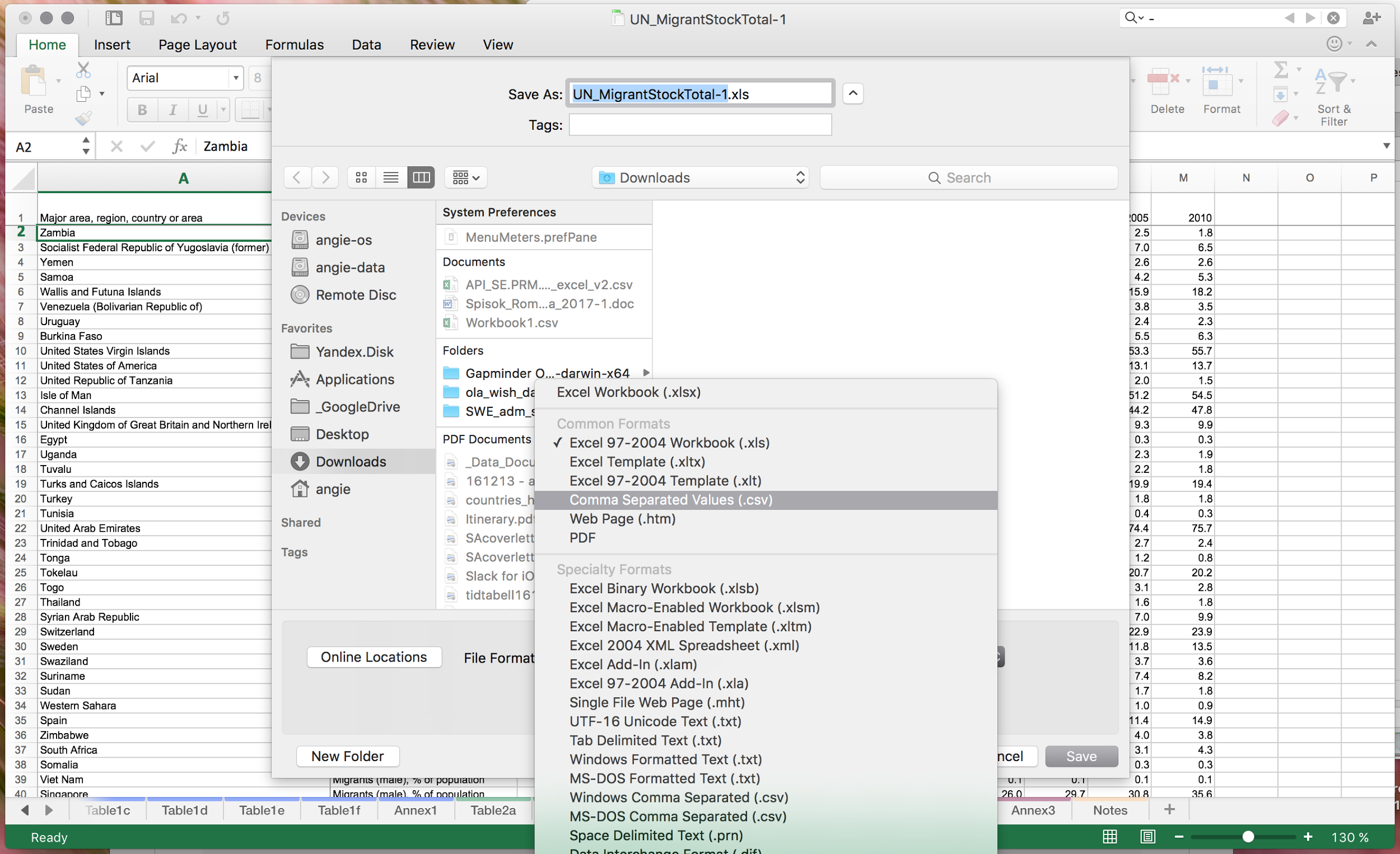
Confirm that you are only exporting the current sheet and that you will lose all the formatting in CSV:

Now you have a CSV file exported.
Return to Gapminder Offline. Click “Time is in columns”, because this is our data arrangement.
Locate the csv file you made on your computer
Press OK and you’re done! Sometimes the bubbles are hiding, when some data is not available. Move the time slider, so maybe it will show up.
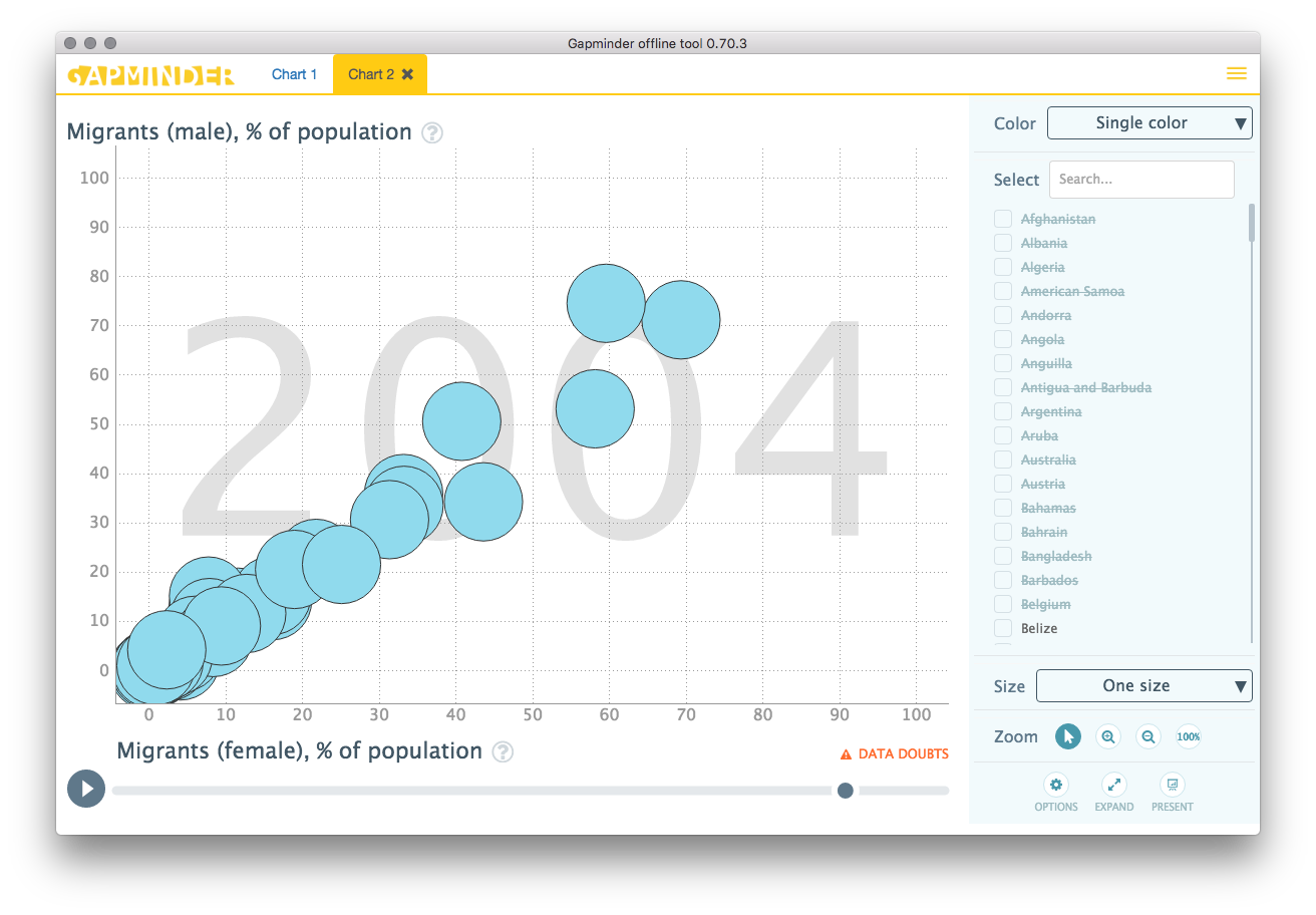
You’re done. Here is an interactive example:
If you are into coding, below is a code snippet you would use to display this data without using Gapminder offline. If you copy and paste it into your website it should still work
<div id="placeholder" class="example-placeholder" style="max-width: 720px; height: 500px; padding-top: 0;"></div>

<link rel="stylesheet" href="//s3-eu-west-1.amazonaws.com/static.gapminderdev.org/vizabi.css">
<link rel="stylesheet" href="//s3-eu-west-1.amazonaws.com/static.gapminderdev.org/bubblechart.css">

<script src="//d3js.org/d3.v4.min.js"></script>
<script src="//s3-eu-west-1.amazonaws.com/static.gapminderdev.org/vizabi.js"></script>
<script src="//s3-eu-west-1.amazonaws.com/static.gapminderdev.org/bubblechart.js"></script>

<script>
var config = {
    "locale": {
      "filePath": "//s3-eu-west-1.amazonaws.com/static.gapminderdev.org/assets/translation/"
    },
    "data": {
      "reader": "csv-time_in_columns",
      "path": "https://raw.githubusercontent.com/Gapminder/vizabi-website/develop/data/UN-migrant-stock-data-exported.csv"
    }
};

Vizabi("BubbleChart", document.getElementById("placeholder"), config);
</script>